
Forms are one of the most important elements on websites or apps. Whether it’s for user registration, data entry, or inquiry submission, form design plays a crucial role in determining user satisfaction. Today, we will explore 14 key principles of form design that make it easier for users to enter information. By following these principles, you can significantly improve the user experience in your digital products.
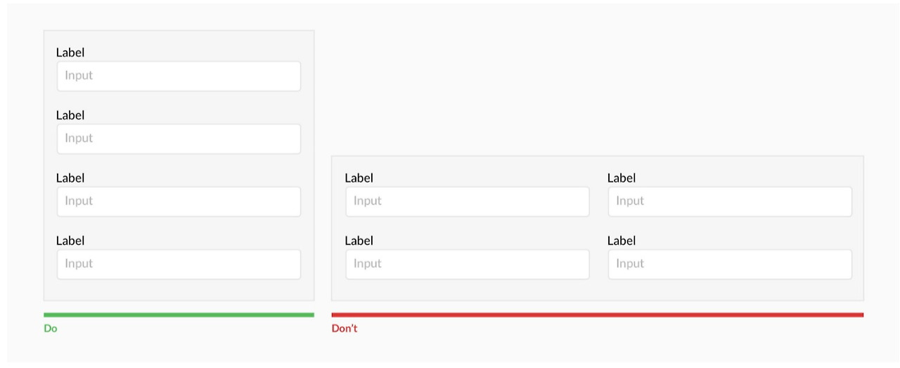
1. Keep a simple, vertical layout
A layout divided into multiple columns can lead to visual complexity in form design. Forms with several columns may disrupt the flow of information, making it harder for users to focus on each field. This issue is even more pronounced for users who read vertically.
A simple, vertically aligned layout helps users quickly understand and easily input information.
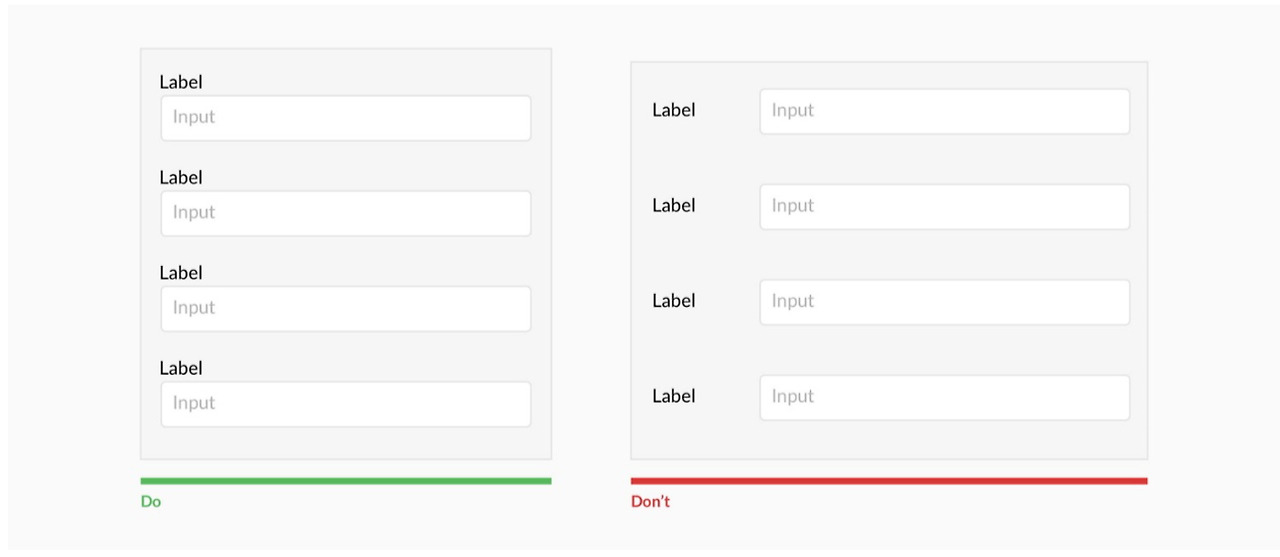
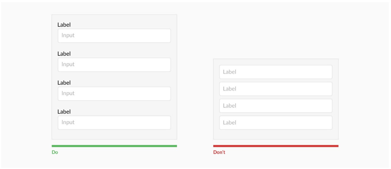
2. Place labels above the fields
Labels positioned above the input fields make it easier for users to understand what to enter. This arrangement works better in mobile environments and provides clarity on the input intention.
In cases where users need to fill in extensive data or select from multiple options, left-aligned labels can be a good alternative. This improves visual flow and helps users quickly grasp the required information.
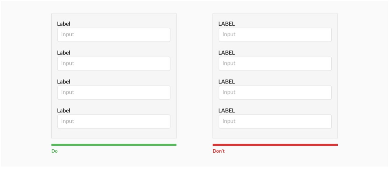
3. Avoid all-uppercase labels
Using all-uppercase labels can cause visual monotony and hinder users from quickly comprehending information. Capital letters should be reserved for emphasis, as overuse can reduce readability.
4. Be cautious with placeholder text
Using placeholders as labels is not a good practice. When users begin typing, the placeholder text disappears, causing them to forget the purpose of the field. Placeholders should be used for additional instructions, while labels should clearly convey the field’s purpose.
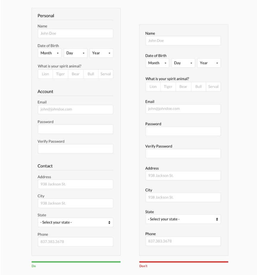
5. Group fields to separate information
A long form can overwhelm users, making it harder to find and input information. Therefore, group related fields together to help users perceive information in manageable chunks. This allows users to better understand the form and fill it out faster.
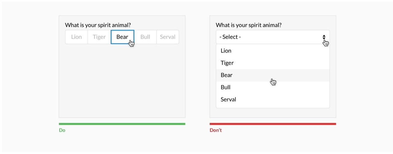
6. Use dropdown menus effectively
Dropdown menus can be inconvenient when fewer than five options are available, as they require two unnecessary clicks. While dropdown menus save space, it’s best to use them when there are five or more options. If there are more than 25 options, consider adding a search function to help users find what they need more efficiently.
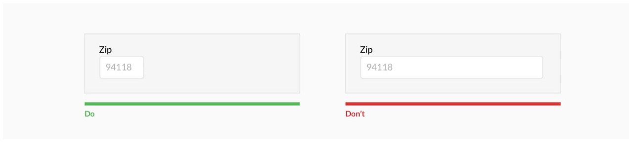
7. Set the appropriate length for input fields
The length of an input field signals how much information users need to enter. For instance, fields like phone numbers or zip codes, which have a fixed format, should be limited in length to guide users towards entering the correct information.
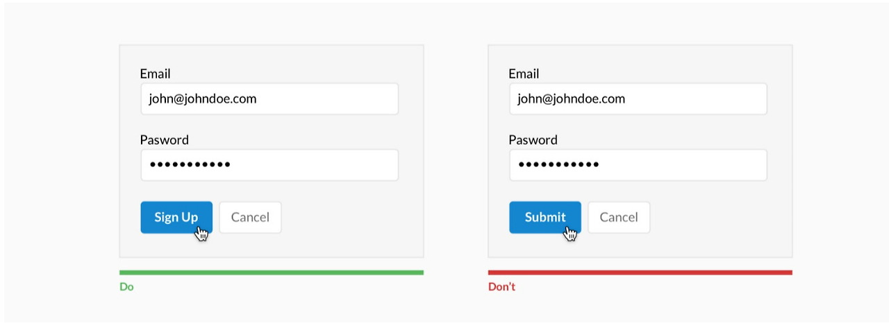
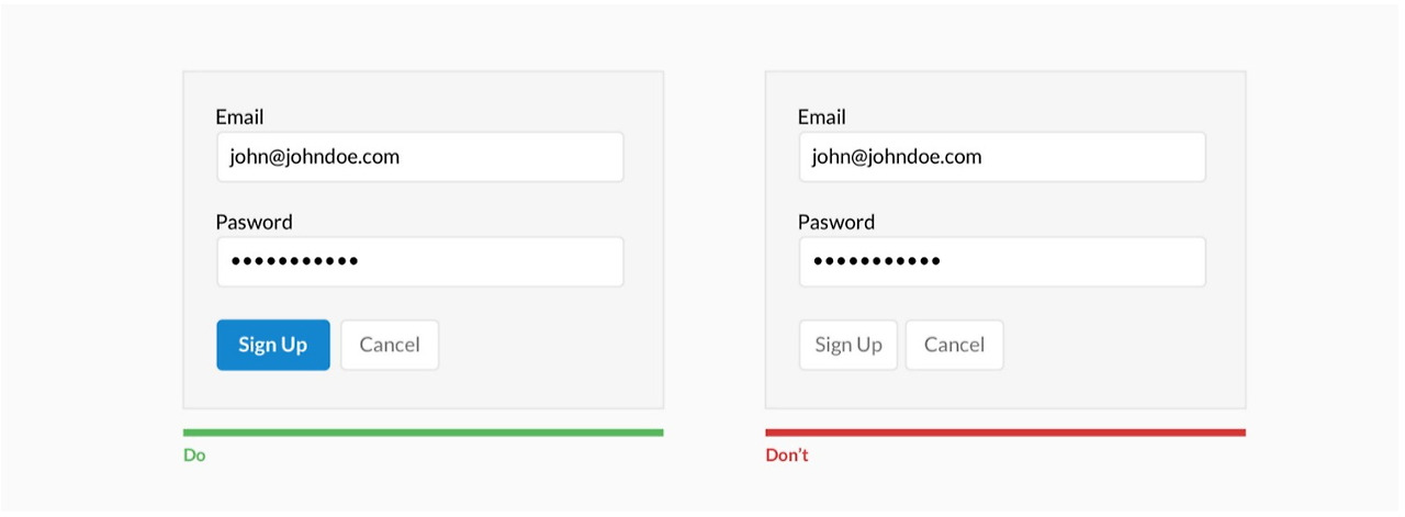
8. Clearly differentiate between primary and secondary actions
There may be several buttons on a form, but it’s essential to clearly distinguish between primary actions (e.g., ‘Submit’) and secondary actions (e.g., ‘Cancel’). This ensures that users focus on the most important tasks.
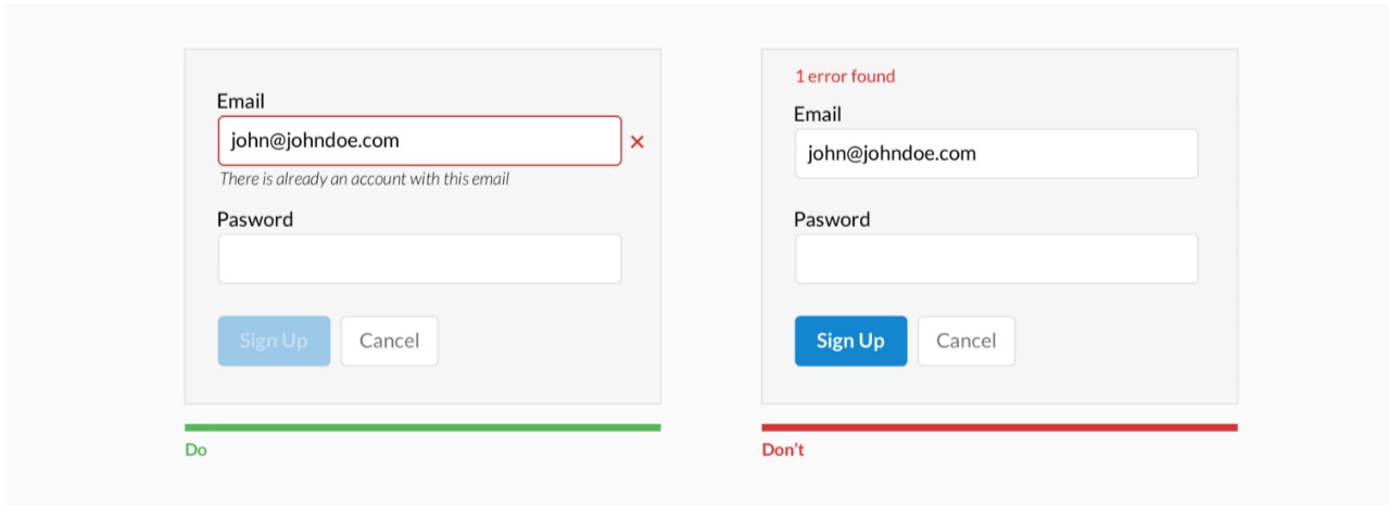
9. Avoid real-time error messages
Displaying error messages in real time while users are entering information can be stressful. Especially for fields like passwords or usernames, it is better not to highlight errors before the input is complete. Showing errors only after the form is submitted can reduce user frustration.
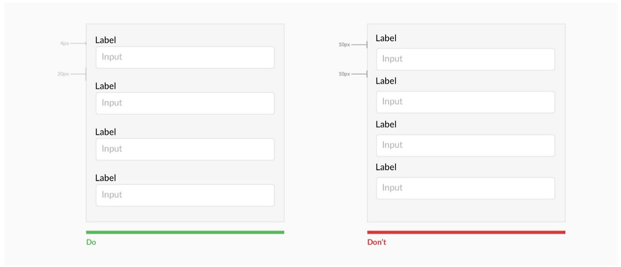
10. Maintain spacing between input fields
Proper spacing between labels and input fields is critical for helping users understand what they need to enter. If spacing is too tight, users may feel confused and struggle to identify the necessary information.
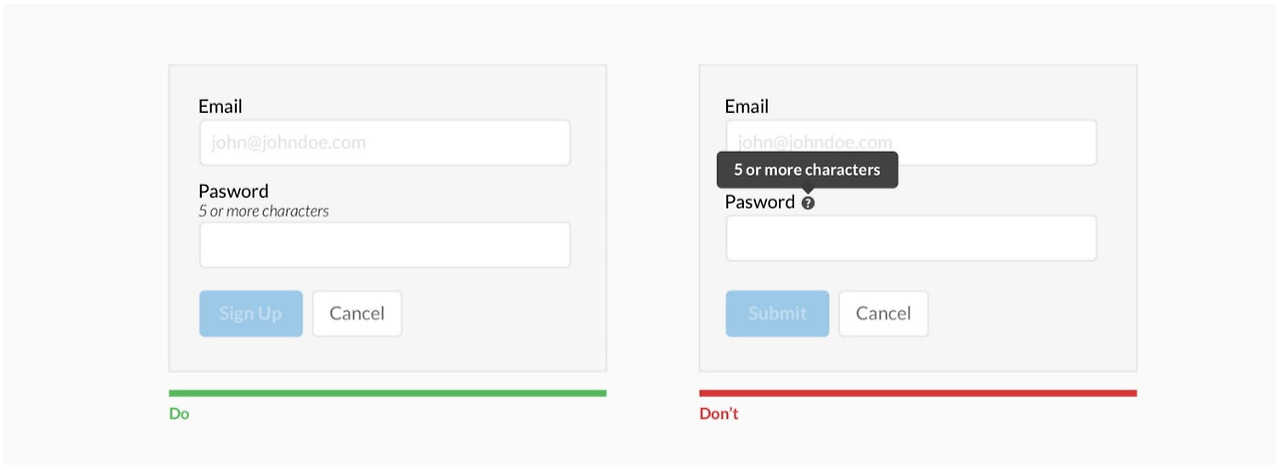
11. Provide helpful tips for users
Adding basic hints next to input fields can help users understand exactly what they need to enter. Such tips are particularly useful for fields that may confuse users and can help reduce input errors.
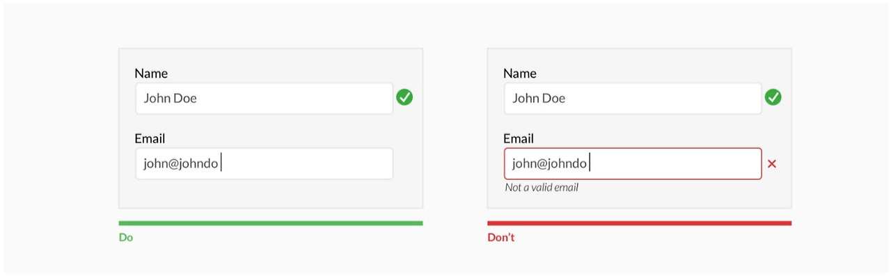
12. Provide clear feedback for errors
When users encounter errors while filling out a form, they should receive clear feedback to help them understand and correct the issue. Providing specific error messages and highlighting the problem areas helps users fix errors quickly.
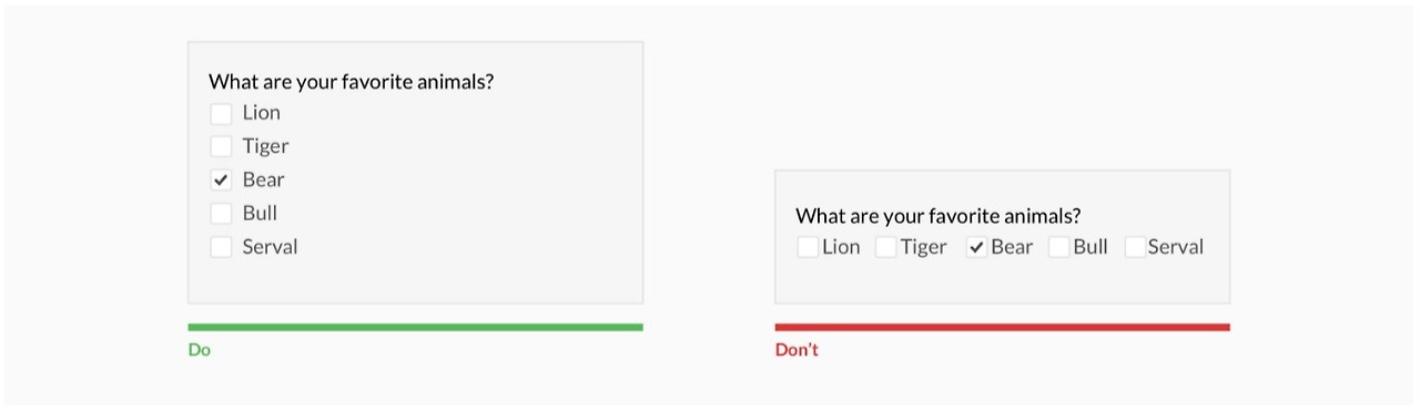
13. Use vertical alignment for checkboxes and radio buttons
Vertical alignment of checkboxes or radio buttons makes it easier for users to compare and select options. This layout simplifies eye movement and reduces confusion by increasing the space between items.
14. Clear call-to-action (CTA) buttons that build trust
The call-to-action (CTA) button in a form should clearly communicate what the user needs to do. Clear button text improves the user experience and builds trust when clicking.
Conclusion
A well-designed form helps users enter information easily and complete tasks quickly, with minimal stress. By following these 14 principles, you can significantly enhance user experience. Simplifying complex processes and reducing visual confusion will boost user satisfaction. Try implementing these principles in your website or application today, and you’ll see the difference in user experience.
Source: UX Planet, “Design Better Forms”